

- Client
- Hepiyi Insurance (a Doğan Holding company)
- Industry
- Insurance
- Services
- Product Design, Design Language, Design System, Mobile Development, Web Applications
- Platform
- Agent mobile app · Customer app prototype · Web portals
- Year
- 2025–2026
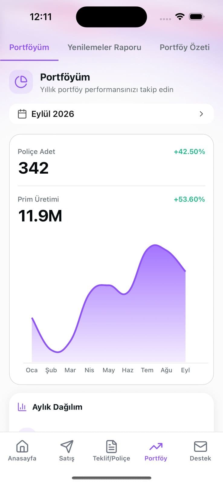
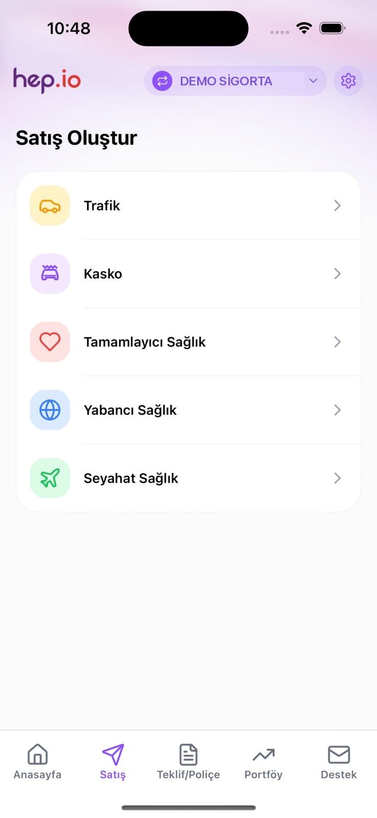
Hepiyi Insurance is a Doğan Holding company with more than 500 employees. Since 2025 we've been designing and building digital products with Hepiyi Insurance for agents, customers and operations teams. The work has three strands: a sales app agents carry in their pocket, the design language for a new customer app, and web portals built on one shared design system.
Hepiyi Acente
An agent's day, in one app.
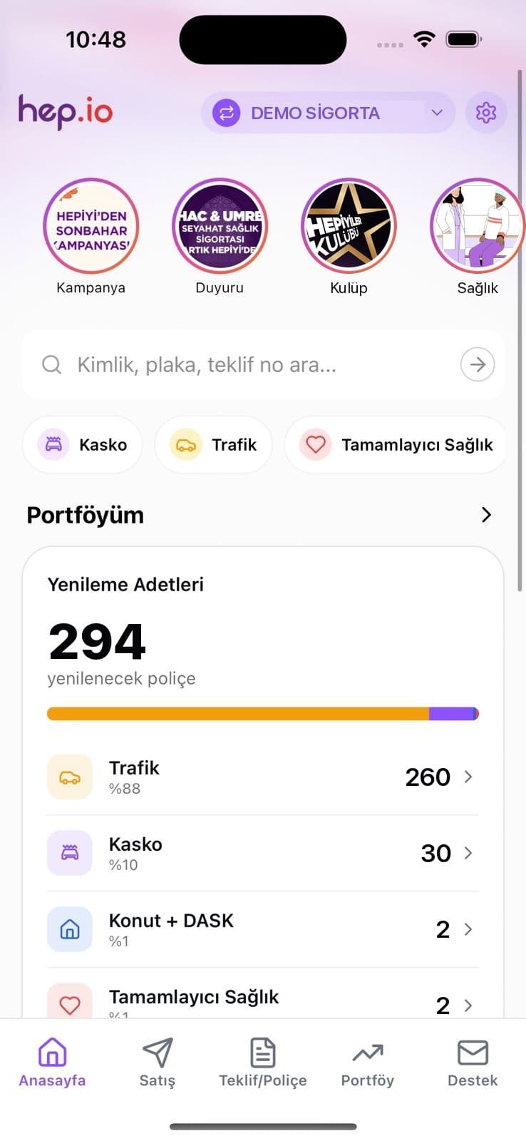
Hepiyi Acente puts an insurance agent's daily work on their phone. Home offers search by ID number, plate or quote number, product shortcuts and the policies due for renewal. The bottom tabs follow the job itself: Home, Sales, Quotes/Policies, Portfolio, Support.
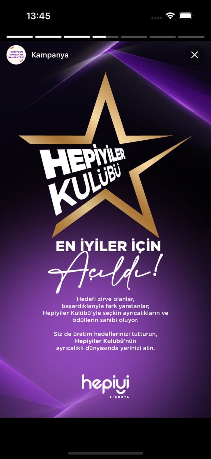
Announcements
Campaigns arrive as stories.
Campaigns, announcements and club news use a pattern agents already know: story rings along the top of the home screen. Tap one and a full-screen player opens, with progress bars and a close button that behave the way people expect.
Customer app · Design language
Quiet Violet.
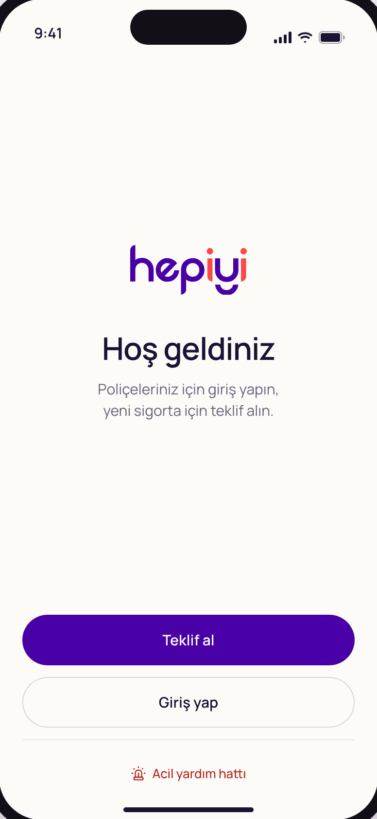
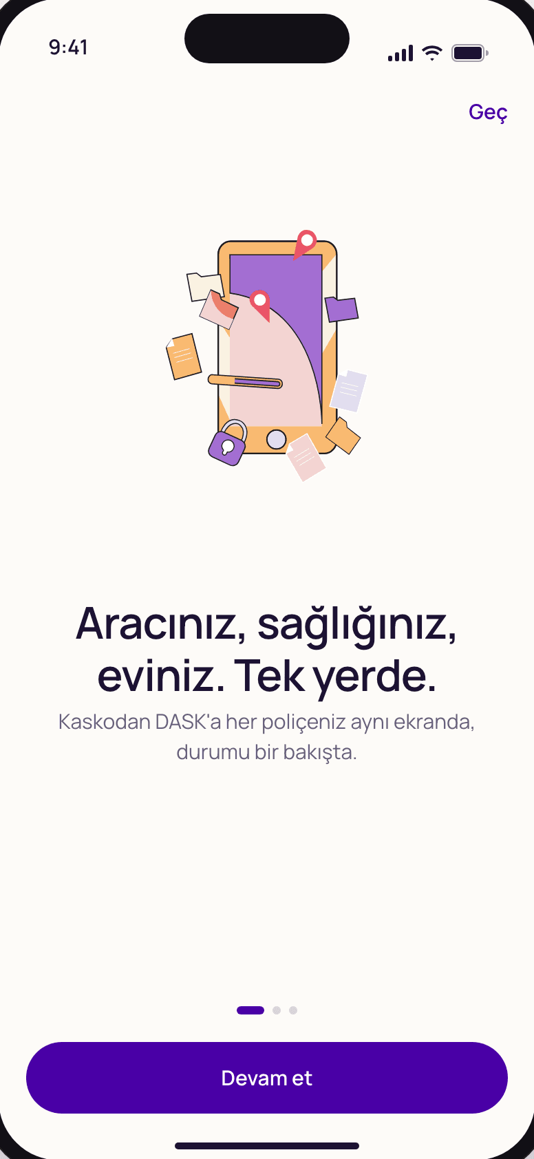
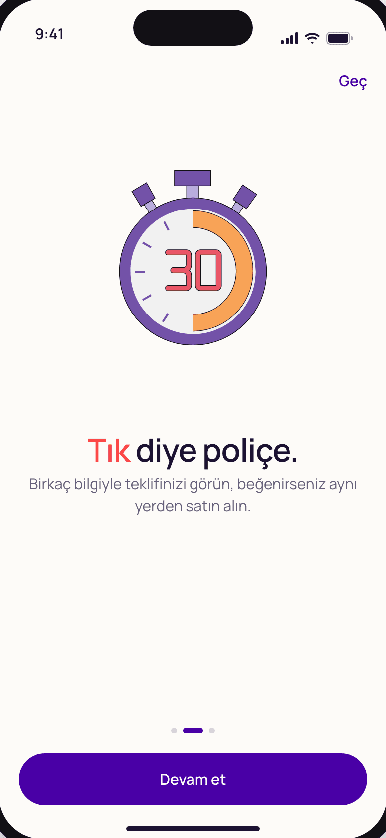
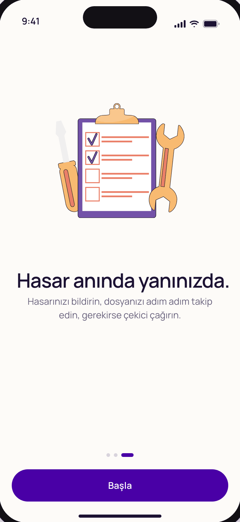
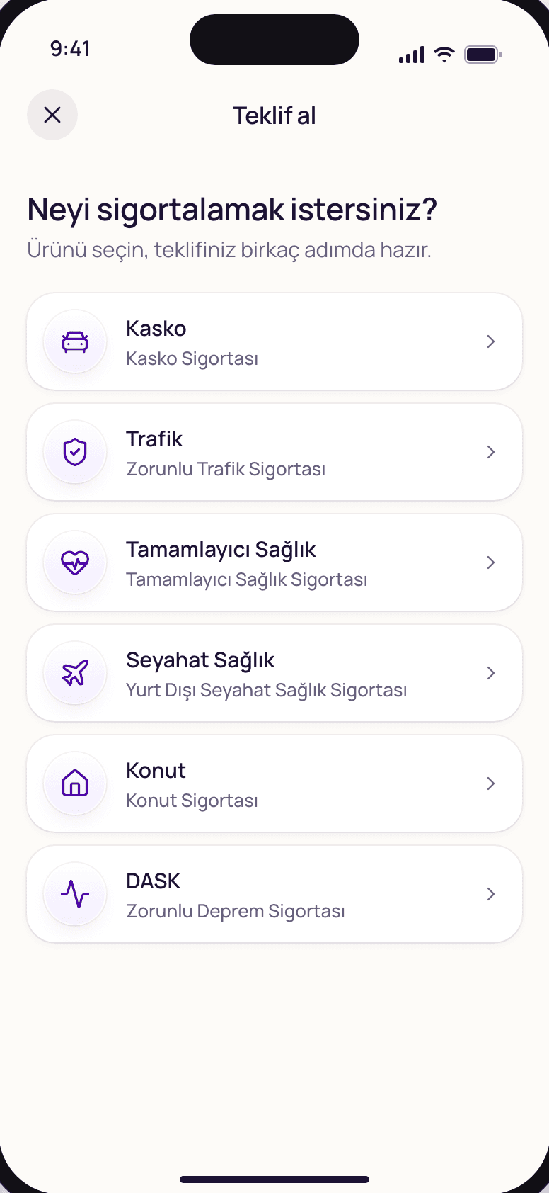
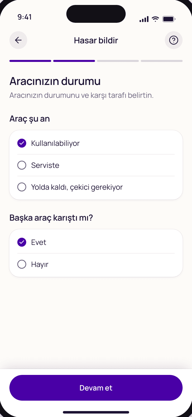
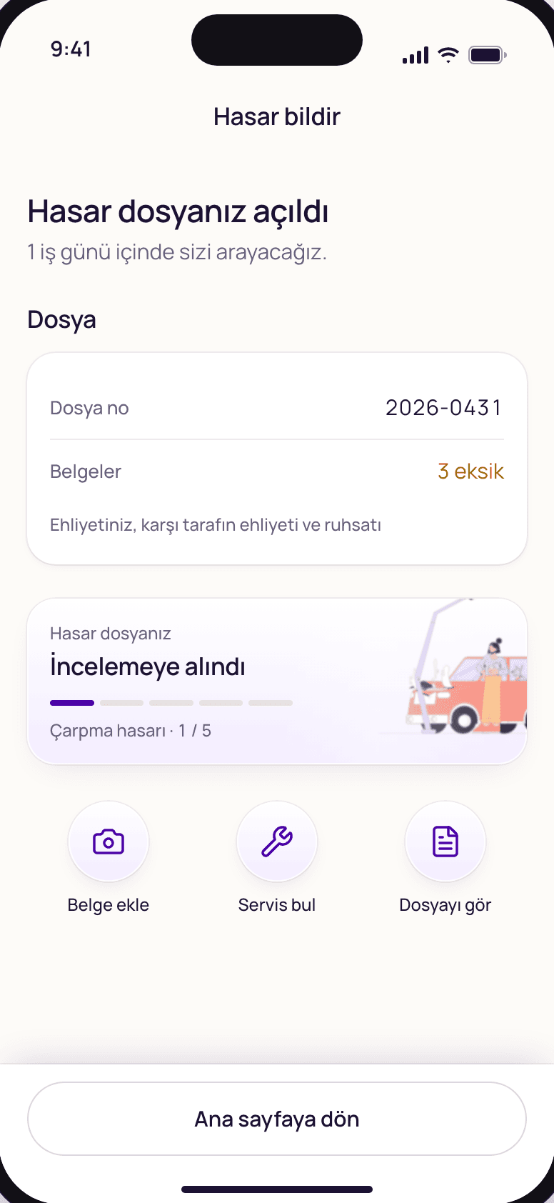
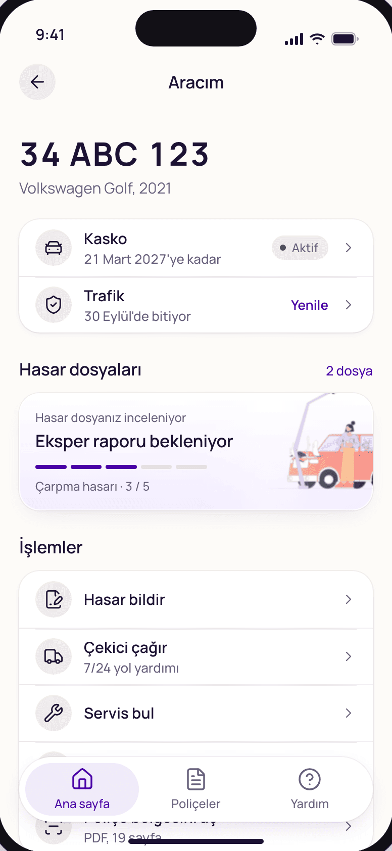
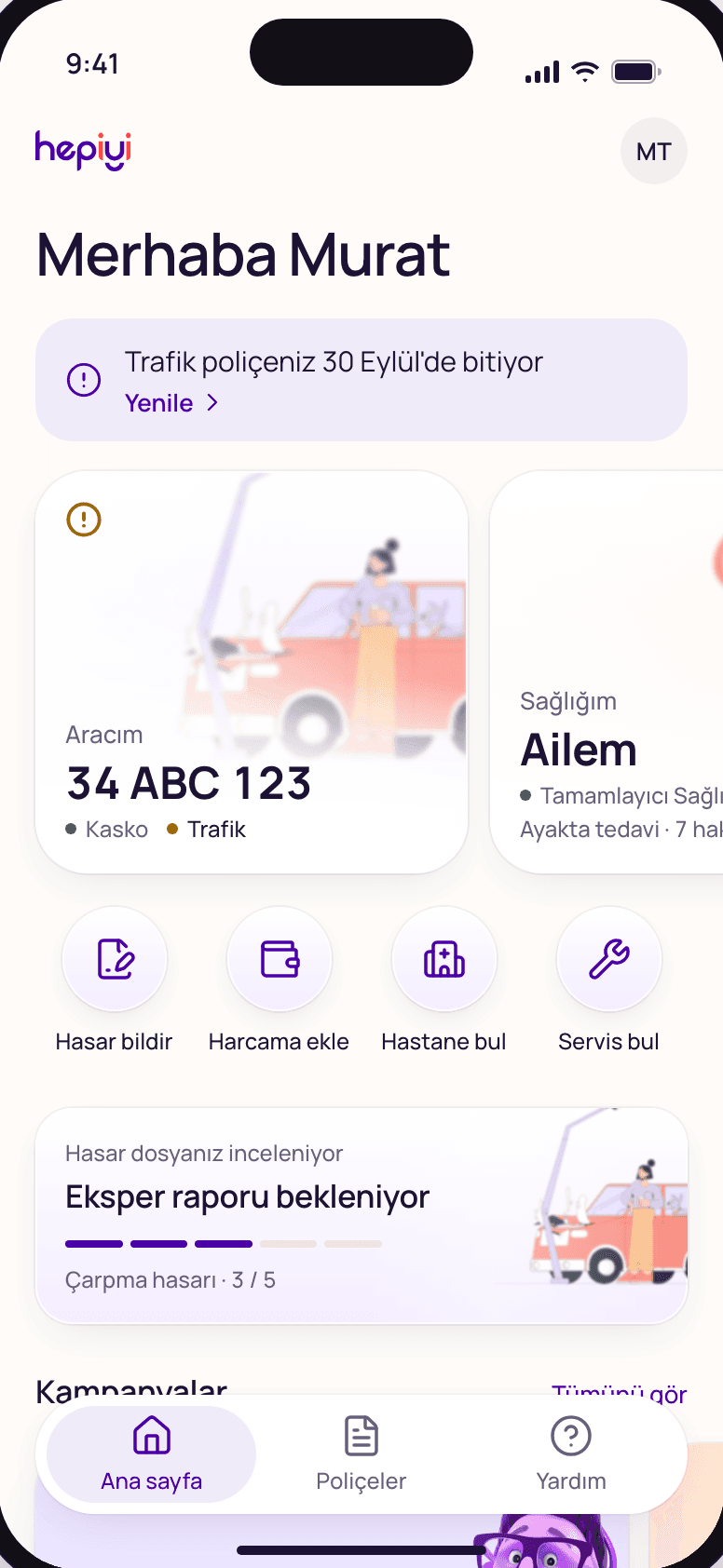
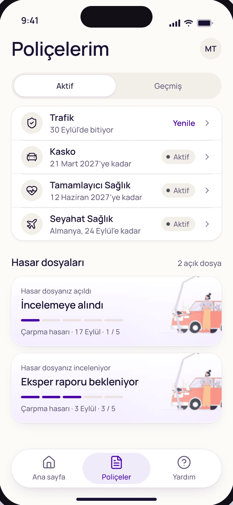
For Hepiyi Insurance's new customer app, we turned the violet, coral and cream of hepiyi.com.tr into a quiet, typography-first language. Three directions were briefed and scored, and the winner borrowed pieces from the other two. The work is currently at the design and prototype stage.
Colour rules
Violet marks state. Coral means buy.
The violet from the logo is never decoration. It marks only the active tab, a selected item, focus, links and completed steps. Coral has one meaning, buy, and appears at most once per screen. Cream sets the temperature; depth comes from frosted tiles, not dark blocks. One typeface, Manrope, with tabular figures throughout.
Quote
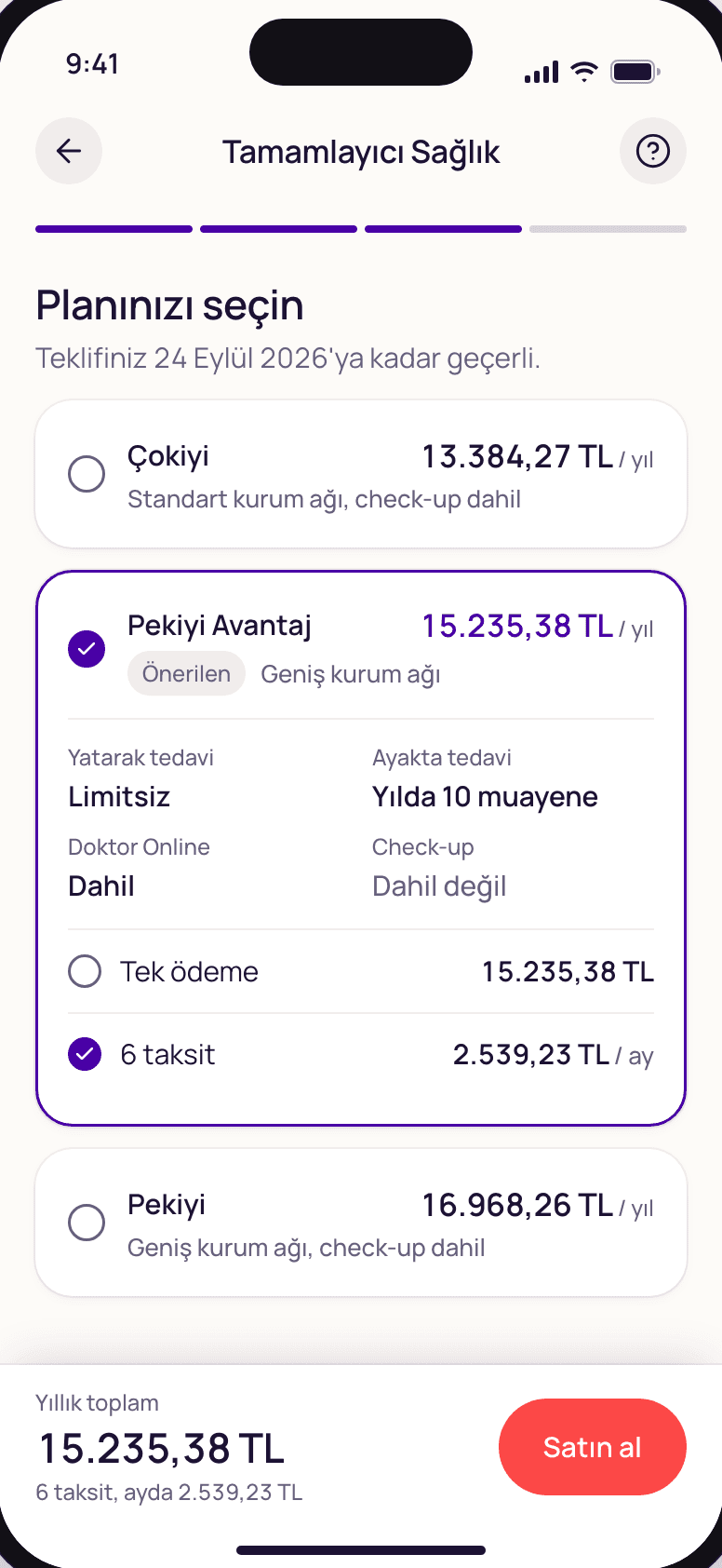
Price first.
The quote screen stacks all three plans with their prices up front; coverage and instalments open inside the card you pick. We considered a paywall-style segmented selector and dropped it, because in insurance people need to see every offer at once. The only coral button on screen is Buy.
Information architecture
My Car, My Health, My Home.
The app is organised around three areas of life rather than product names, and the plate becomes the car's identity. Home leads with one priority status sentence, then area tiles and quick actions. Travel isn't an area of its own; it's treated as an event.
Web portals · @hepiyi/ui
One design system, two portals.
The back office for Hepiyi staff and the multi-tenant portal for customers and partners share one foundation: @hepiyi/ui. It brings 36 Radix components in the shadcn/ui lineage, data tables that keep their state in the URL, a form layer, light and dark themes and real RTL support. Salvage tenders, claim requests and legal workflows are built from it.
The collaboration continues across product design, implementation and delivery. We also work on internal operations tools for Hepiyi.